Afterpay
×
[woochimp_form]

Styling a home with colour is never an easy task. Sometimes, even with the best intentions, colours can prove to be a lot tougher to work with than you would think. Here at Luxe Walls, we want to make sure that with the help of our wallpapers, you are maximising your colour styling to help make your spaces pop. So to help you to not dig yourself into a colour coordinating hole, here are some colour mistakes that you are best to steer clear of.
A lot of people fail to consider general lighting in their rooms before choosing their colours, especially natural light. Most commonly, choosing a darker shade can be a great statement for a room, but if a space does not have the right amount of light to balance it out, the space can easily look overly dark and depressing.
Lighting can also change the shade of the original colour you planned. To help avoid a potential lighting drama, put up a sample colour on your planned part of the room, and if the lighting changes it to something you don’t quite like, take it back to a store and an assistant should help you choose the correct shade.
Everybody loves adding a bit of colour to their rooms, but sometimes the saying, “the more the merrier” doesn’t always quite apply when it comes to colour. The best way to tell if you are overwhelming your room with colours is if it feels the opposite of relaxing – like the walls are closing in. An easy way to fix this is to gradually eliminate colours until the room feels peaceful again. A key element is making sure each colour is evenly spread around the room.
Opposite of the problem above, a major issue can also be not having enough variety. It’s understandable if you like to play it safe with your colour palettes and don’t want things to clash, but if everything starts to resemble a similar colour, a space can quickly turn dull. A room can easily fall into the trap of feeling repetitive, predictable and without any soul. Easiest way to fix this is to add small elements in your space that have nothing to do with the colour palette at all. A bit of difference will give some life to the space and get rid of that sameness.
If you prefer that different rooms in a house or building are best being kept separate to one another, that is completely fine. But, if you’re feeling like your spaces are too hectic or have too much going on, cohesion is key. Cohesion isn’t completely about using the same colour palette in each room, but having colours that you can view from another room to complement each other. Simple way to fix this is to add tie-in decorative elements that contain colours from other rooms – this way your rooms don’t feel like a bunch of disconnected parts.
Choosing different rooms within a large open space to have completely different colour palettes is definitely not ideal. Creating this sort of two-tone division can create a stark contrast and a sense of awkwardness in the flow of your decor. A great way to stylishly change interior colours in this sort of space is to use slightly different shades of the same colour – what interior stylists call a ‘logical colour shift’.
A common phenomenon that can happen when choosing colours, particularly for a wall, is getting it put into a room and finding out it is WAY too bright. Often this harshness comes as a surprise, many people thinking it is the perfect shade when choosing it in store. If this does happen, don’t give up immediately. Play around in store with differing more palatable tones that suit your space.
The way a room looks has a lot to do with how a room feels. Sometimes, liking a colour doesn’t necessarily mean you will like the feeling of being potentially surrounded by that colour in your space. For example, it wouldn’t be the best idea to have a bright red in a room where you sleep, since it is the opposite of relaxing. The best results are always achieved when you mix your favourite colours with a colour palette that suits the expected mood of your room. It’s all about getting that balance.
As much as we all love those bold statement colours, sometimes covering a room in accenting hues can overwhelm people when walking into a space. Even the most colourful spaces need spots for the eye to rest. Make sure you keep some form of neutral space in a room, or add in some neutral colours to balance out the boldness.
Different shades of flooring will have a major impact on how a colour will look in a room. The floor is a major player when choosing your space’s colours, and can potentially affect the overall tonality of the room.
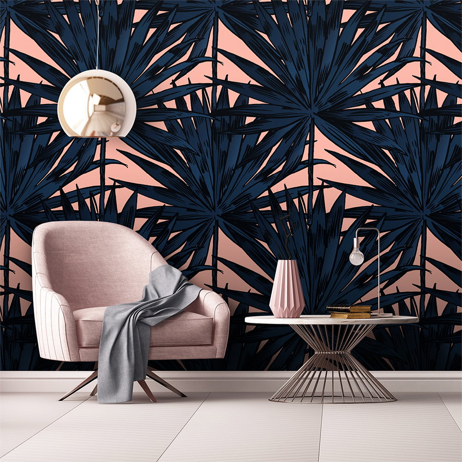
There is no denying you will avoid making major colour mistakes if you always play it safe. But where is the fun in that?! Sometimes, feeling like your house is too dull or boring with no statements is the biggest mistake of all! If this is the case and you are not sure what statement to try, Luxe Walls wallpaper is definitely your best bet.
Now that you know the top 10 colour mistakes to stay away from, choosing a palette to style your spaces should hopefully be a lot easier. Time to get colouring!