Wallpaper Colour Psychology: How Wall Colours Affect Your Mood and Wellbeing
How Wallpaper Colours Influence Your Daily Life
The colours surrounding us have a profound impact on our emotions, energy levels, and even productivity. When you choose wallpaper, you're not just picking a pattern — you're shaping the emotional atmosphere of your home.
The Science Behind Colour Psychology
Research in environmental psychology confirms what designers have long understood: colour directly affects our physiological and psychological states.
- Warm colours (reds, oranges, yellows) increase heart rate and stimulate energy
- Cool colours (blues, greens, purples) lower blood pressure and promote relaxation
- Neutral tones (whites, greys, beiges) create a sense of calm and spaciousness
- Dark colours (navy, charcoal, forest green) evoke intimacy and sophistication
Room-by-Room Colour Guide
Bedroom — Calm and Restful
Best colours: Soft blues, muted greens, warm blush, lavender
Your bedroom should be a sanctuary. Cool, muted tones signal to your brain that it's time to wind down. Studies show that people sleeping in blue-toned rooms get an average of 7 hours and 52 minutes of sleep — more than any other colour.
Avoid: Bright reds, vivid oranges, or high-contrast patterns that stimulate alertness.
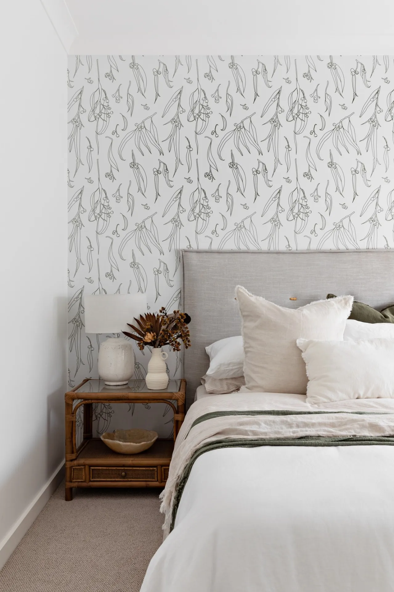
Our recommendation: Soft botanical prints in sage green or dusty blue create the perfect sleep environment.
Living Room — Warm and Welcoming
Best colours: Warm neutrals, soft terracotta, golden yellows, sage green
The living room is where you gather, relax, and entertain. Warm tones foster conversation and connection, while greens create a grounding, natural atmosphere.
Tip: A feature wall in warm terracotta or a golden botanical pattern makes the space feel inviting without overwhelming it.
Home Office — Focused and Productive
Best colours: Blue-greens, soft yellows, light grey, muted teal
Productivity research consistently points to blue and green tones as the most conducive to focused work. Yellow accents can boost creativity and optimism — perfect for brainstorming spaces.
Avoid: Red (increases anxiety in work settings) and very dark colours (can feel oppressive during long hours).
Our recommendation: Geometric patterns in teal or blue-grey create a professional yet inspiring workspace.
Kitchen and Dining — Appetising and Social
Best colours: Warm yellows, soft oranges, cream, warm whites
It's no coincidence that restaurants favour warm colour palettes. Warm tones stimulate appetite and create a convivial atmosphere perfect for family meals.
Tip: A cheerful botanical or citrus-toned pattern in the dining area can make every meal feel special.
Children's Rooms — Playful yet Calming
Best colours: Soft pastels, gentle greens, warm pinks, light blues
Children's rooms need to balance stimulation for play with calm for sleep. Soft, warm pastels provide visual interest without overstimulation.
Avoid: Neon colours or very busy patterns that can increase hyperactivity and make settling difficult.
Understanding Colour Temperature
Beyond individual colours, the temperature of your palette matters:
Warm palettes (reds, oranges, yellows, warm whites):
- Make rooms feel cosier and more intimate
- Ideal for south-facing rooms in Australian homes that receive less natural light
- Best for social spaces — living rooms, dining rooms, entryways
Cool palettes (blues, greens, purples, cool whites):
- Make rooms feel more spacious and airy
- Perfect for north-facing Australian rooms that get abundant sunlight
- Best for restful spaces — bedrooms, studies, meditation rooms
The Australian Light Factor
Australia's uniquely bright, warm natural light affects how colours appear on your walls:
- Colours appear more vivid in Australian sunlight compared to the UK or Northern Europe
- Cool tones balance the warmth of strong Australian light beautifully
- Dark colours work better in well-lit Australian rooms where they won't feel cave-like
- Samples are essential — always view wallpaper samples in your room's specific light conditions at different times of day
Pattern and Colour Combined
The pattern of your wallpaper interacts with colour psychology too:
- Large-scale patterns in calm colours create a sophisticated, serene atmosphere
- Small, detailed patterns in warm tones feel cosy and traditional
- Geometric patterns in cool tones convey modern precision
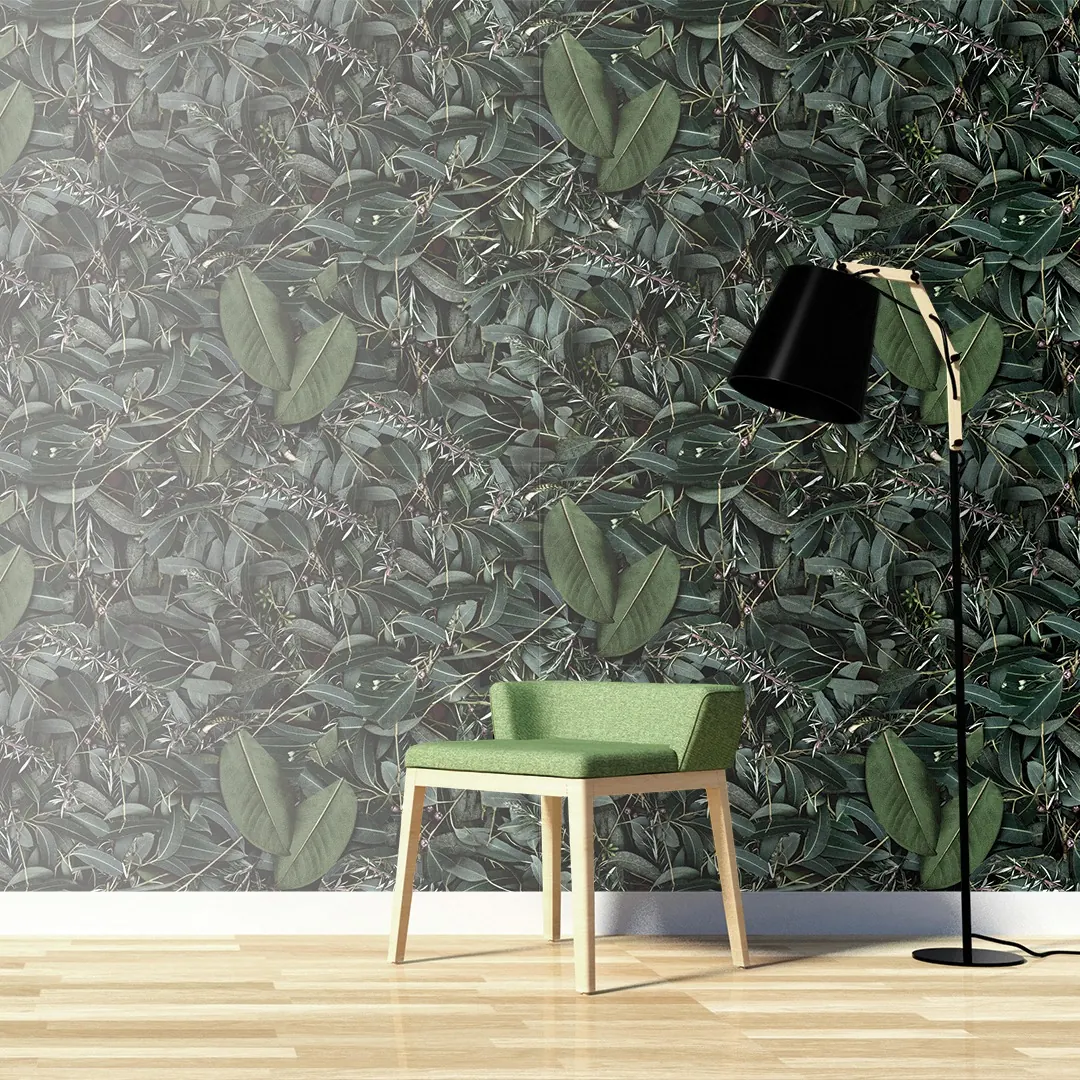
- Organic, flowing patterns in natural greens promote biophilic wellbeing
Practical Tips for Choosing
- Start with the room's purpose — What emotion do you want to feel in this space?
- Consider natural light — Observe your room at morning, midday, and evening
- Order samples — Colours on screen never perfectly match reality
- Think about adjacent rooms — Ensure colour flow between connected spaces
- Trust your instincts — If a colour makes you feel good, that's the best psychology of all
The Mood Board Approach
Before committing, create a simple mood board:
- Pin your wallpaper sample to a board
- Add fabric swatches, paint chips, and photos of existing furniture
- Live with it for a few days
- Notice how you feel each time you look at it
Colour psychology isn't about rigid rules — it's about understanding how colours make you feel and using that knowledge to create spaces that support your daily life.
Frequently Asked Questions
Explore Related Collections
Continue Reading
15 Bedroom Wallpaper Ideas That Australian Interior Designers Love
Inspiration • 9 min read
Feature Wall Ideas for Australian Homes
Inspiration • 8 min read
Wallpaper in the Kitchen and Laundry: Splashbacks, Pantries and Small-Space Wins
Inspiration • 8 min read

Japandi Wallpaper Ideas for Australian Homes
Inspiration • 7 min read